

Vintage Printed Carpet: How to Choose the Best One for Your Home
2026-09-25
A vintage printed carpet can be the soul of a room, but only if you choose the one that truly fits your home. With endless patterns, faded palettes, and pile textures to sort through, it's easy to fall for a look that doesn't hold up in real life. That's where a little guidance helps. Here at Senseco, we've narrowed down the practical details that separate a lasting favorite from a regretted impulse buy—so you can shop with confidence.
Why a Vintage Printed Carpet Feels Like a Story Underfoot
A vintage printed carpet doesn’t try to impress you all at once. Its appeal gathers slowly: the slight irregularity of a hand-blocked border, the way a floral repeat seems to breathe in one corner and fade in another. Underfoot, the flat weave gives a grounded, almost papery feel—each step a kind of contact with something that has already lived through years of quiet rooms and hurried mornings.
The imagery on these carpets often carries fragments of older traditions—botanical sprigs, geometric runs, faded medallions—but time has softened their symmetry into something more conversational. You notice a petal that disappears into a fold, a vine that stops mid-curve as if the printer had another thought. These are not flaws; they’re pauses in a long narrative, and your own feet become part of the telling.
Over months and years, a vintage printed carpet continues to shift. Sunlight will gently lift more color from one side, a favorite path from door to sofa will press the fibers flatter. In that slow accumulation of wear, the rug stops being an object and becomes a kind of diary—written not in words, but in the changing texture and light beneath you.
The Pattern You Pick Changes the Whole Room's Mood
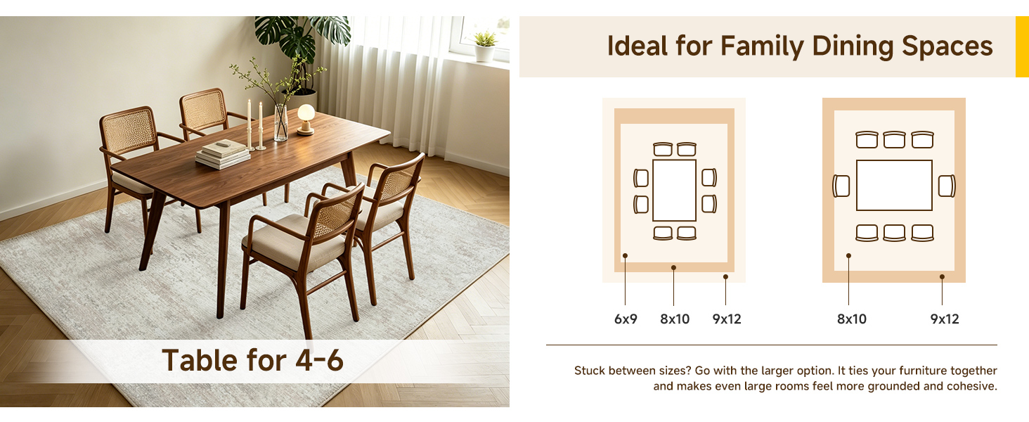
A room rarely feels neutral once pattern enters the picture. Swap a pale, barely-there motif for large-scale botanicals and the space seems to exhale—soft, unhurried, almost garden-like. Go the opposite direction with tight geometric repeats and suddenly the same four walls feel sharper, more awake, as if the room is leaning forward.
Scale matters more than most people expect. A small checkerboard print can read as quiet texture from across the room, while an oversized plaid or mural-style stripe pulls the eye outward and makes a compact space feel staged rather than stuffed. The same color palette can produce completely different moods simply by changing how often a shape repeats.
Texture within the pattern pushes that effect even further. A faded, imperfect block print suggests comfort and age, while a high-contrast digital motif can feel crisp and slightly restless. Before committing to a color, it helps to ask what the room should do—settle people in or keep them moving. The pattern will answer that question every time.
Cheap vs. Quality: What to Check Before You Buy
The first thing to ignore is the price tag alone. A cheap item can look almost identical to a quality one in photos, but turn it over and you'll see the difference. Check the stitching, the weight of the fabric, the zippers or clasps. Quality pieces have tight, even seams and hardware that feels solid rather than hollow.
Next, look for signs of rushed production. Loose threads, misaligned patterns, glue residue, or a strong chemical smell are all red flags. A quality item usually has clean finishing inside and out, even in places you don't immediately see. If the lining is flimsy or the edges are unfinished, it won't hold up.
Finally, ask what you're actually paying for. With a cheap version, you're often paying for a short lifespan—fading, stretching, or breaking after a few uses. A higher price doesn't always guarantee quality, but it should mean better materials and a longer usable life. Compare the return policy and warranty, too; brands confident in their product tend to offer more than a 30-day window.
Color Rules Worth Breaking (and a Few to Keep)
Most color advice sounds like it was written for a timid watercolor class. "Never mix black and navy." "Stick to three colors per room." "Neutrals are safe." These rules have their place, but they also flatten personality. Breaking them can turn a forgettable space into one that actually feels like you. The trick is knowing which rules are just fear disguised as wisdom.
Take the old "no more than three colors" rule. A room with five or six well-chosen colors can feel layered and lived-in rather than chaotic—especially if you repeat them in different textures. Or the rule against mixing warm and cool tones. A navy sofa with rust-colored pillows works because the contrast adds depth. Even the notorious "don't put bold color in a small room" falls apart when you see a tiny powder room drenched in deep teal. It feels intimate, not cramped. These aren't reckless choices; they just require a little more attention to proportion and undertone.
Still, a few rules earn their keep. Avoid super-saturated colors in a room with no natural light—they can turn muddy. Balance visual weight so one side of a room doesn't feel heavier than the other. And if you're going to break a rule, do it with intent. A single unexpected color choice looks deliberate; a dozen random ones looks confused. Keep the rules that help you see, and toss the ones that only keep things beige.
Where You Place It Makes All the Difference
The spot you choose for your speaker isn't just a matter of convenience—it shapes the entire soundscape of your room. Place it in a corner and bass becomes boomy and uneven, while tucking it into a bookshelf can choke the midrange and blur the stereo image. Even small shifts, like moving it a few inches away from a wall or turning it slightly toward the listening area, can transform a muddy mix into a clear, balanced performance.
Reflective surfaces are silent saboteurs. Glass tables, bare floors, and hard walls send sound bouncing around, creating echoes that smear detail. A simple solution is to position the speaker so its tweeters sit at ear level when you're seated, and consider adding a rug or curtain to dampen early reflections. If you're working with a desktop setup, pull the speaker forward from the back edge to reduce boundary interference—the difference in tightness and clarity is immediate.
Don't overlook symmetry and distance. Two speakers placed unevenly relative to your listening position will skew the stereo field, making vocals drift off-center. Measure the distance from each speaker to your ears; ideally they should be equal, forming an equilateral triangle. And if you must place a speaker near a wall, give it some breathing room—even six inches can clean up the low end and let the upper frequencies shine without smearing.
Simple Habits That Keep Vintage Carpets Looking Amazing
Most vintage rugs hate aggressive cleaning more than they hate dirt. A plain suction-only vacuum used once or twice a week pulls out grit before it works its way into the fibers, but skip the rotating brush head—it can chew through fragile wool and cotton. If the rug has fringe, vacuum across it rather than into it, or use a handheld attachment on low power. Lifting the corners to check for trapped dust keeps the pile from matting down.
When something spills, don't reach for the heavy-duty carpet shampoo. Blot the area with a clean white cloth and cold water, working from the outside inward so the stain doesn't spread. Mild castile soap diluted in water usually handles most food and drink spots, but test it on a hidden corner first. Never rub the fibers hard, and let the spot air-dry away from direct heat.
A surprising amount of damage comes from light and uneven wear. Rotate the rug every three to six months so no single path gets crushed, and pull curtains or use UV-filtering window film in rooms with strong afternoon sun. On a dry, breezy day, airing the rug outside in shade for a couple of hours also releases musty odors and restores some of the wool's natural bounce.
FAQ
Check fiber density and backing. Wool holds up better than synthetics, and a tight weave means it won't mat down easily. Flip it over: if you can see individual knots clearly, that's usually a good sign.
Pull out a small accent from the room—like a cushion or wall art—and match one hue in the carpet to that. You don't need everything to match, just one echoed tone. Better yet, see the rug in your space at different times of day because natural light changes how the print reads.
Larger, open motifs can actually make a small room feel bigger than busy, tiny repeats. Look for prints with some background space rather than all-over clutter. A faded central medallion often anchors the eye without overwhelming the floor.
True vintage pieces show uneven wear, dye variations, and sometimes repaired areas. Printed reproductions usually have a uniform fade that looks too regular. If the price seems too good for a "vintage" wool rug, it's likely a modern print on polypropylene.
It's doable, but pick a low-pile or flatweave version and treat it with a stain guard. Darker backgrounds and busy patterns hide spills best. Keep a spot cleaner on hand and don't put it directly under chairs that get dragged a lot.
For a hand-knotted wool antique, anything from $800 to several thousand for a room-size piece is normal. Printed reproductions run $200-$600. If you're on a budget, look for a vintage Turkish or Persian kilim with a worn look—often under $500.
Ask the seller to take a photo by a window in daylight, not under warm bulbs. Request a close-up of the fringe and a corner folded back. If they won't do that, walk away—color accuracy is the main complaint with vintage rugs bought online.
Vacuum with the beater bar off, both sides, once a week. For stains, blot with cold water and a wool-safe detergent, never rub. Every couple of years, have it professionally washed by someone who specializes in antique textiles.
Conclusion
A vintage printed carpet brings more than just floor covering; it carries a sense of history and personality that modern rugs often lack. The right pattern can shift an entire room—bold geometrics add energy, soft florals calm the space, and distressed motifs quiet a busy layout. Don't be afraid to mix eras or ignore conventional color rules: a faded terracotta or muted indigo can anchor a room better than a perfectly matched beige. Of course, what you're actually buying matters more than the look. Flip the carpet over and check the weave density and backing. A tightly knotted or well-printed piece with a sturdy cotton or wool base will hold up to daily traffic, while a flimsy synthetic copy may look striking online but sag and pill within months. If the price feels too good to be true, inspect the fiber content and ask about colorfastness before you commit.
Placement is equally important. A vintage print works best where it can be seen and used, not hidden under a dining table that never gets moved. Try it in an entryway to set the tone, or layer it over a larger neutral rug in the living room to define a conversation area without fighting your furniture. Leave at least 18 inches of floor visible around the edges so the design doesn't feel cramped. Once it's down, treat it like the worn-in favorite it is: vacuum with the beater bar off, rotate it every couple of months to even out fading, and blot spills with a dry cloth instead of scrubbing. A little sun fading is normal and part of the charm, but if you want to keep colors sharp, draw sheer curtains during the brightest hours. With a bit of common sense, a vintage printed carpet won't just look good on day one—it will keep telling its story for years.
Contact Us
Contact Person: Ivy Yin
Email: [email protected]
Tel/WhatsApp: +86 18519681805
Website: https://www.sensecomarketing.com/